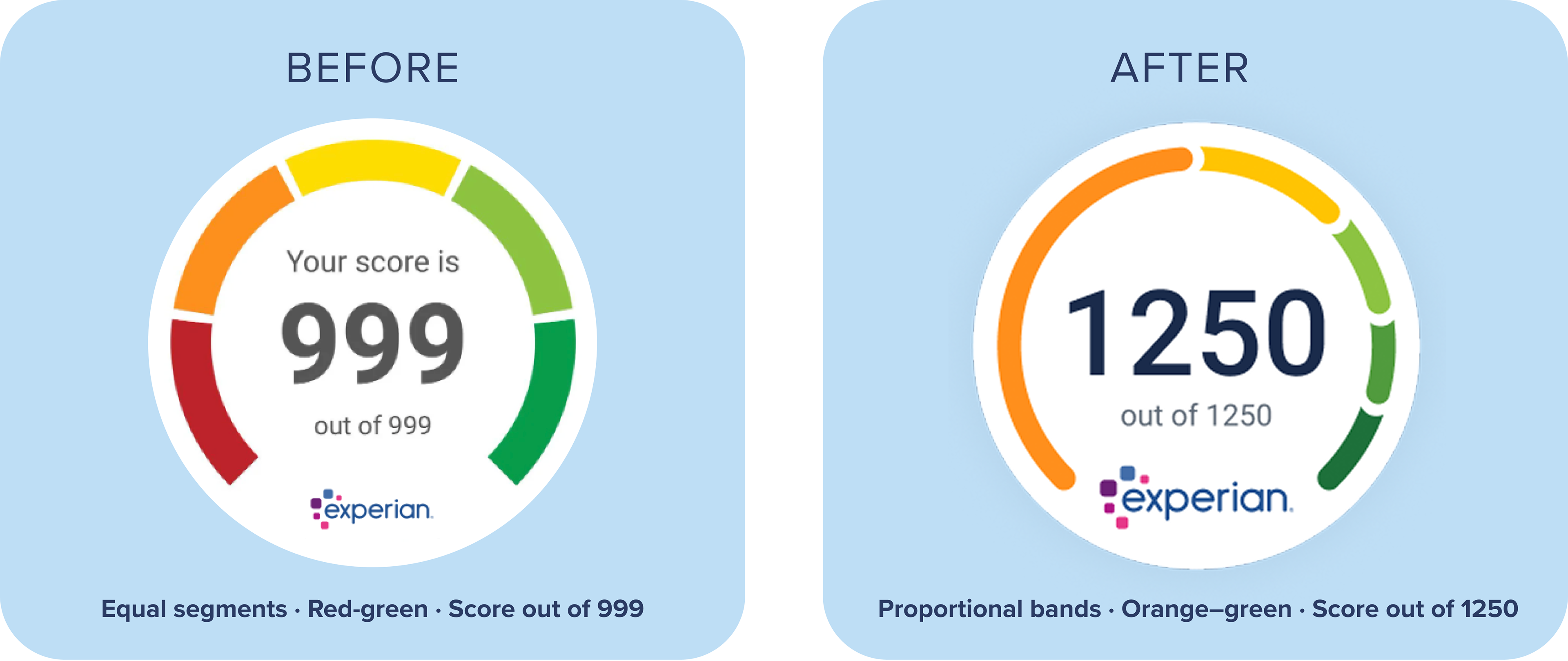
Overview: The existing Credit Score Dial didn’t accurately reflect customers’ progress, making it difficult to understand how close they were to improving their score. Its use of red also risked reinforcing negative emotions for already vulnerable users.The existing Credit Score Dial didn’t accurately reflect customers’ progress, making it difficult to understand how close they were to improving their score. Its use of red also risked reinforcing negative emotions for already vulnerable users.
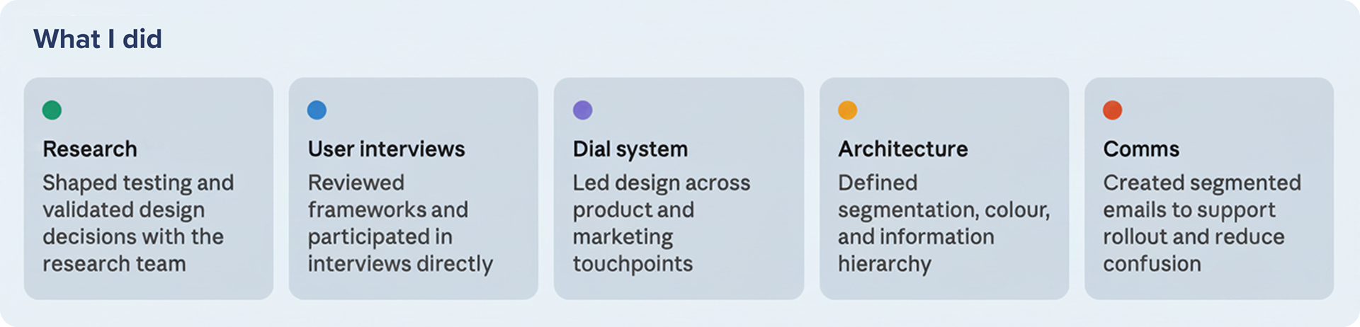
My role: Led the end-to-end redesign of the Experian Credit Score Dial, partnering with research, product and marketing teams to shape the strategy, user experience and rollout across product and communications.Led the end-to-end redesign of the Experian Credit Score Dial, partnering with research, product and marketing teams to shape the strategy, user experience and rollout across product and communications.
The approach: Redesigned the experience to accurately reflect score progression, reduce emotional bias and help customers understand how to improve.
The approach: Redesigned the experience to accurately reflect score progression, reduce emotional bias and help customers understand how to improve.
The solution
Accurate segmentation: Mapped the dial to real score ranges, creating a fairer and more trustworthy representation.Mapped the dial to real score ranges, creating a fairer and more trustworthy representation.
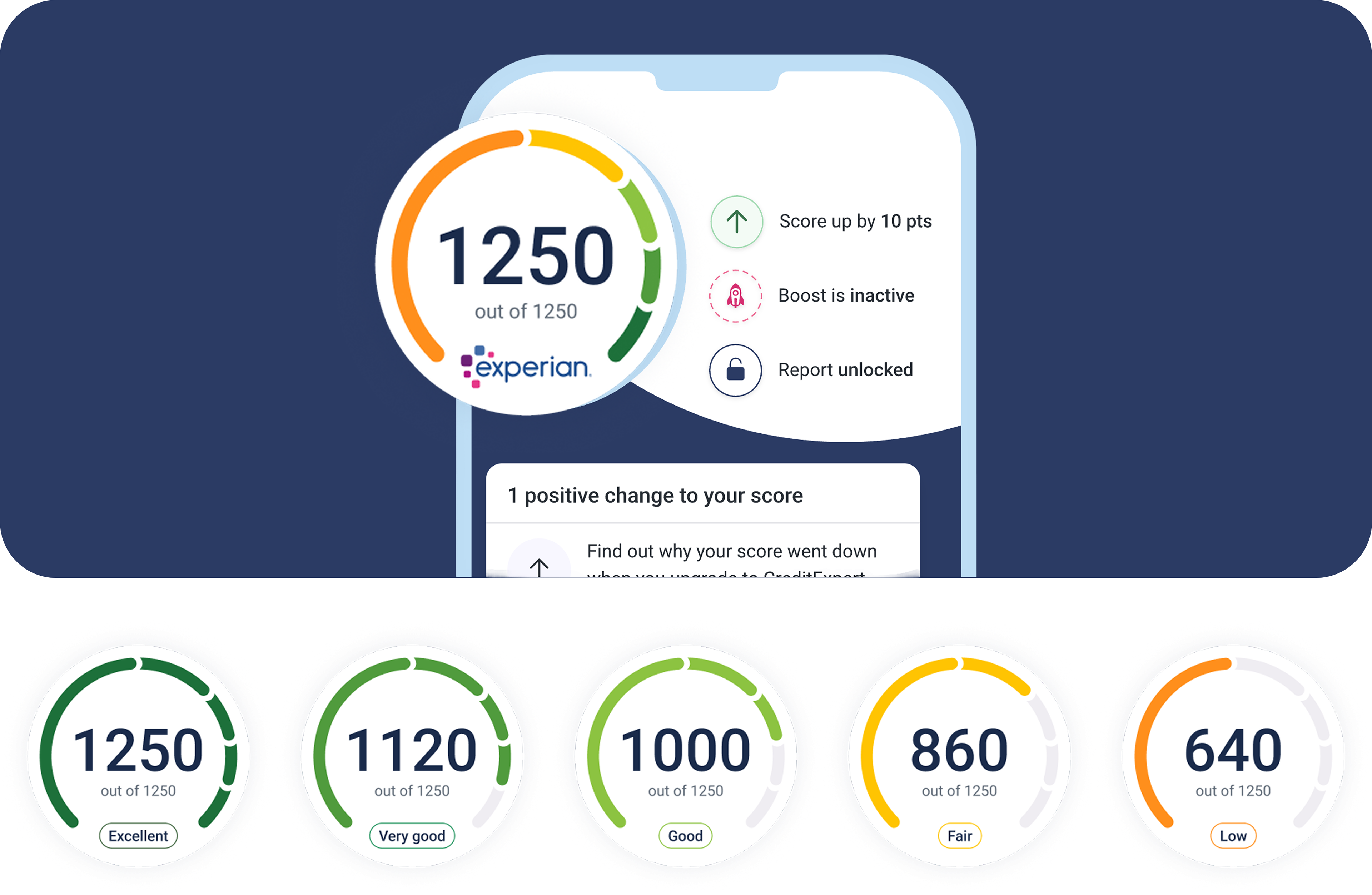
Clearer progress: Made it easier for users to understand their position and distance to the next band
Supportive colour system: Replaced red with an orange–green gradient to reduce feelings of judgement
Scalable system: Designed for use across product and marketing
Impact: Improved customer understanding of their score, reduced service centre calls following launch and created a more consistent experience across product and marketing touch-points.
Accurate segmentation: Mapped the dial to real score ranges, creating a fairer and more trustworthy representation.Mapped the dial to real score ranges, creating a fairer and more trustworthy representation.
Clearer progress: Made it easier for users to understand their position and distance to the next band
Supportive colour system: Replaced red with an orange–green gradient to reduce feelings of judgement
Scalable system: Designed for use across product and marketing
Impact: Improved customer understanding of their score, reduced service centre calls following launch and created a more consistent experience across product and marketing touch-points.