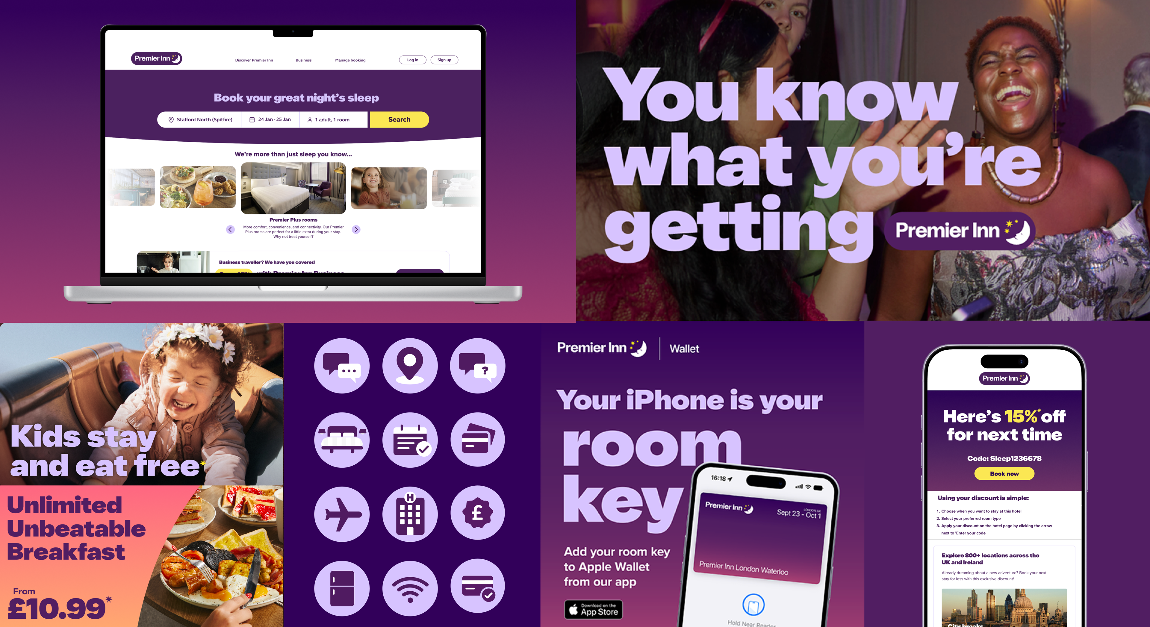
Overview: Premier Inn needed to evolve its visual identity, while retaining it's recognised brand equity, this was about evolving,
not reinventing.
My Role: Led the development of the campaign’s visual identity within the Premier Inn design team, working collaboratively with Leo UK and DaltonMaag to shape a cohesive system across typography, colour and visual elements.
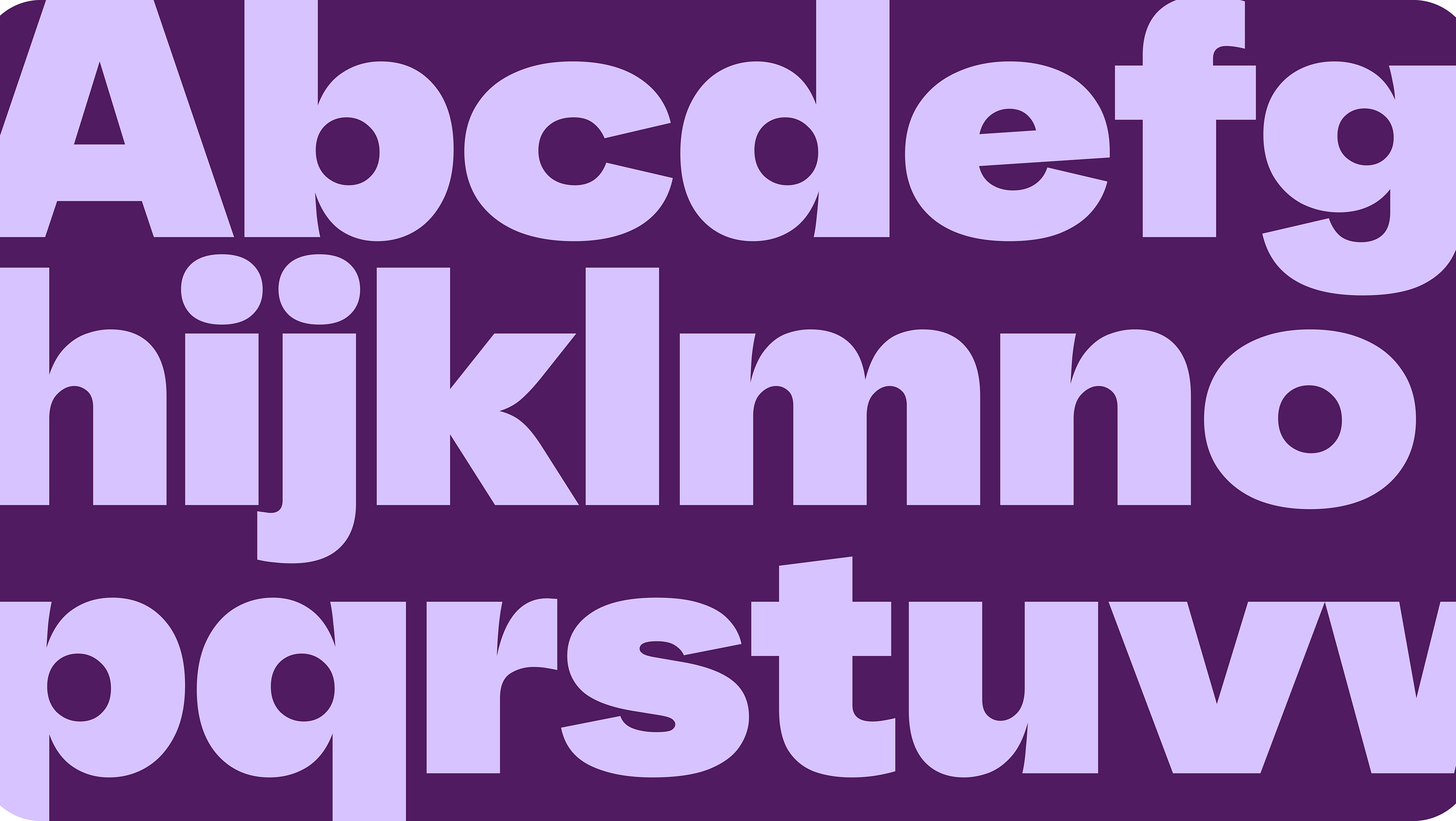
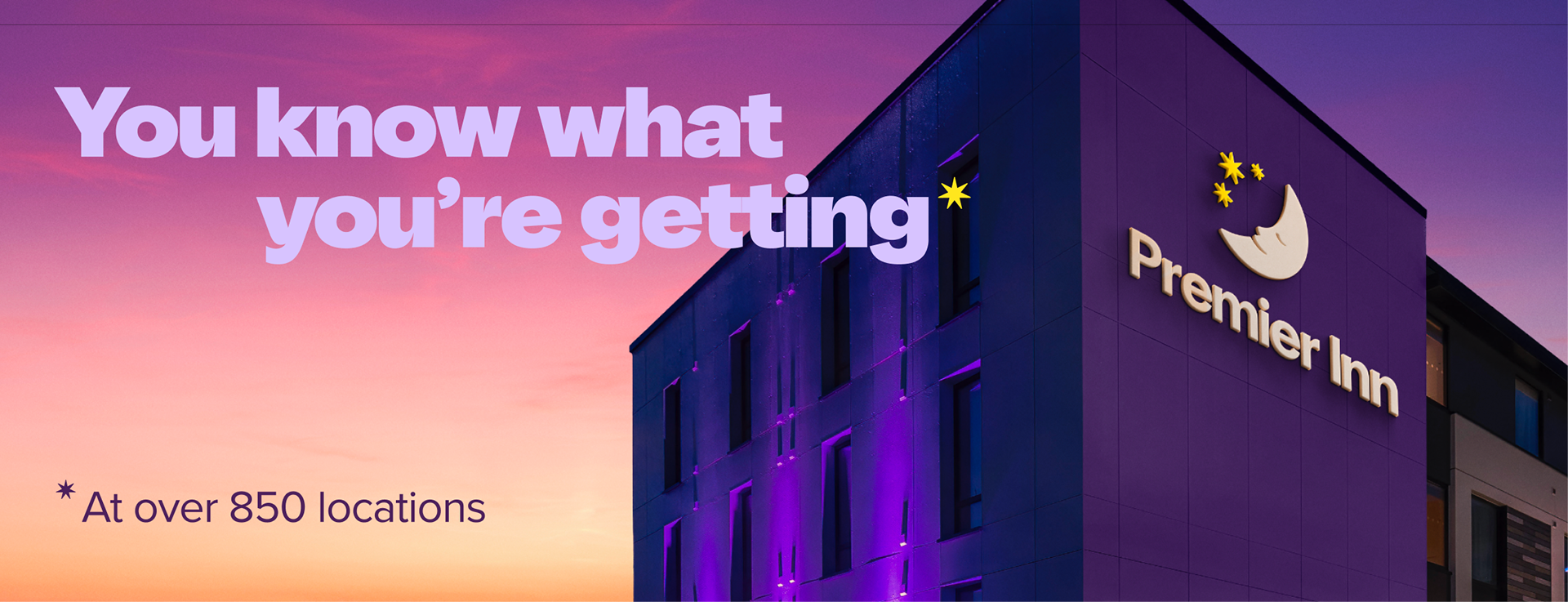
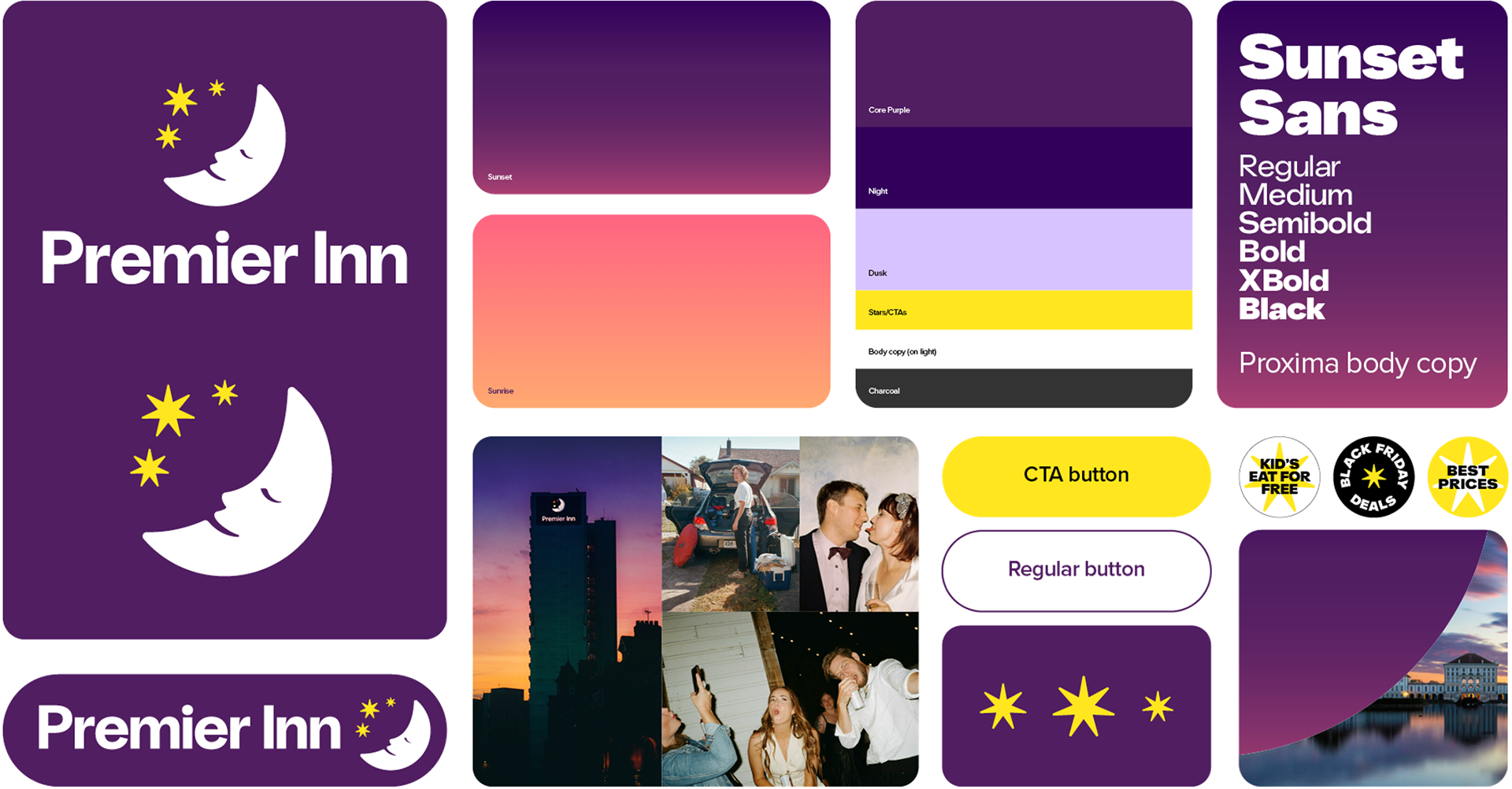
Approach: The identity centred on the journey from sunset to sunrise, reflecting Premier Inn’s promise of a great night’s sleep. A refreshed visual toolkit—sunset‑to‑sunrise gradients, updated graphics and the bespoke SunsetSans typeface—created a unified, flexible system across all campaign communications.
Impact: Established a scalable visual framework for the campaign, strengthening brand consistency while enabling marketing teams to apply the identity across multiple channels.
not reinventing.
My Role: Led the development of the campaign’s visual identity within the Premier Inn design team, working collaboratively with Leo UK and DaltonMaag to shape a cohesive system across typography, colour and visual elements.
Approach: The identity centred on the journey from sunset to sunrise, reflecting Premier Inn’s promise of a great night’s sleep. A refreshed visual toolkit—sunset‑to‑sunrise gradients, updated graphics and the bespoke SunsetSans typeface—created a unified, flexible system across all campaign communications.
Impact: Established a scalable visual framework for the campaign, strengthening brand consistency while enabling marketing teams to apply the identity across multiple channels.